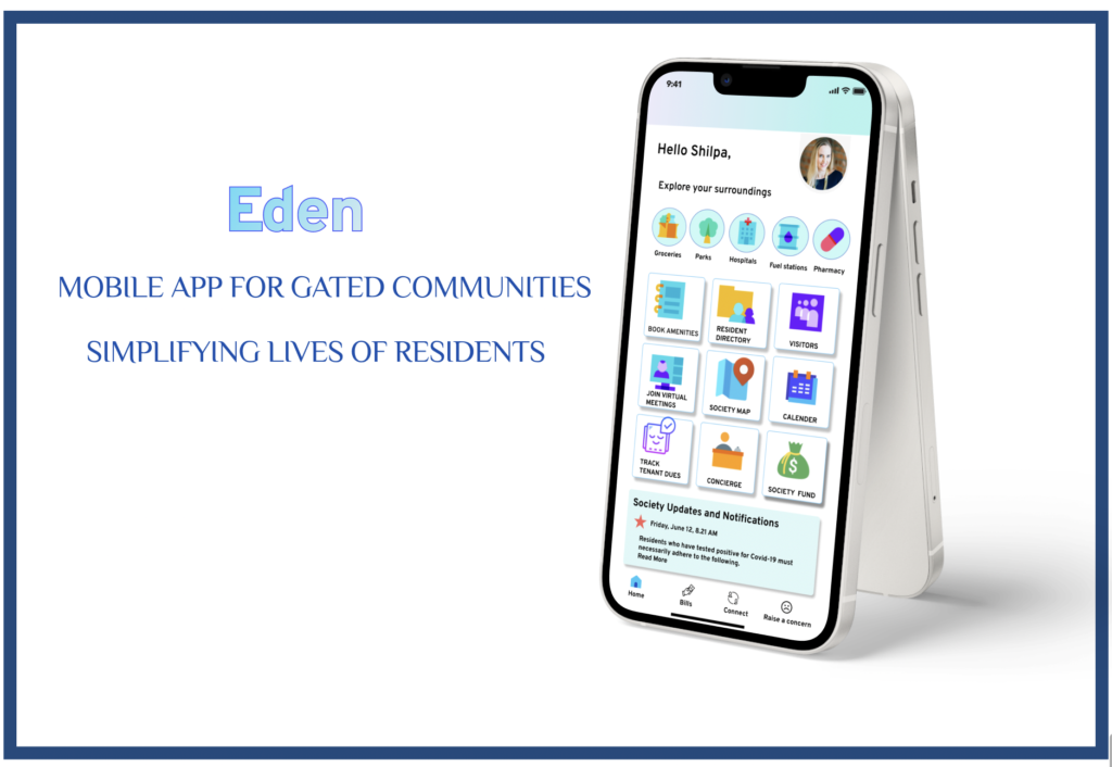
Eden-UX/UI Case study
Challenge
Today’s professionals are busier than ever. Managing busy work schedules along with managing home, payment of dues, ensuring safety, and timely resolution of household problems is a difficult task. Also, with the pandemic outbreak, people are experiencing high levels of stress, anxiety, and loneliness.
Solution
Looking at the day-to-day problems of the community inspired me to come up with a solution to help residents have an easy and happy living and hence brought me to the idea of creating an online platform, and a one-stop solution to all community needs and named it as “Eden, A delightful place to live in”
Research Goals
>To understand how residents think about their experience with gated communities.
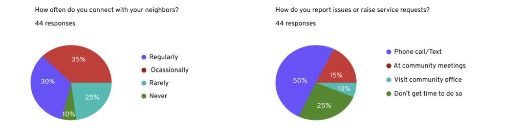
>To find out how they report any issues or raise service requests.
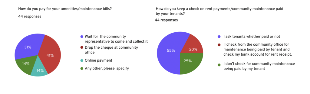
>To identify the methods adopted to pay/track rent/utility bills and book amenities.
>To know how connected they are with their neighbors.
Research Methodology
I decided on two different methods to fit the timeline:
- Survey
- Interviews
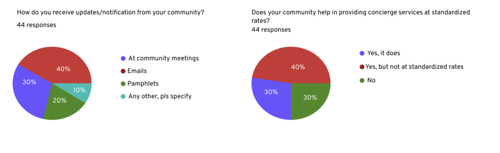
I undertook a quantitative research method by conducting a survey since I wanted to collect data from a larger group. My target audience was residents in a gated community in the age group of 18-60 years. The survey revealed some of the methods residents used to make payments for their utility/amenity bills and raise/report service requests/issues.
I conducted 5 user interviews to gather diverse perspectives and insights and identify and validate key user needs and design requirements. The interviews helped me understand how residents think and feel about their experience with gated communities.
Survey Outcome


User Personas
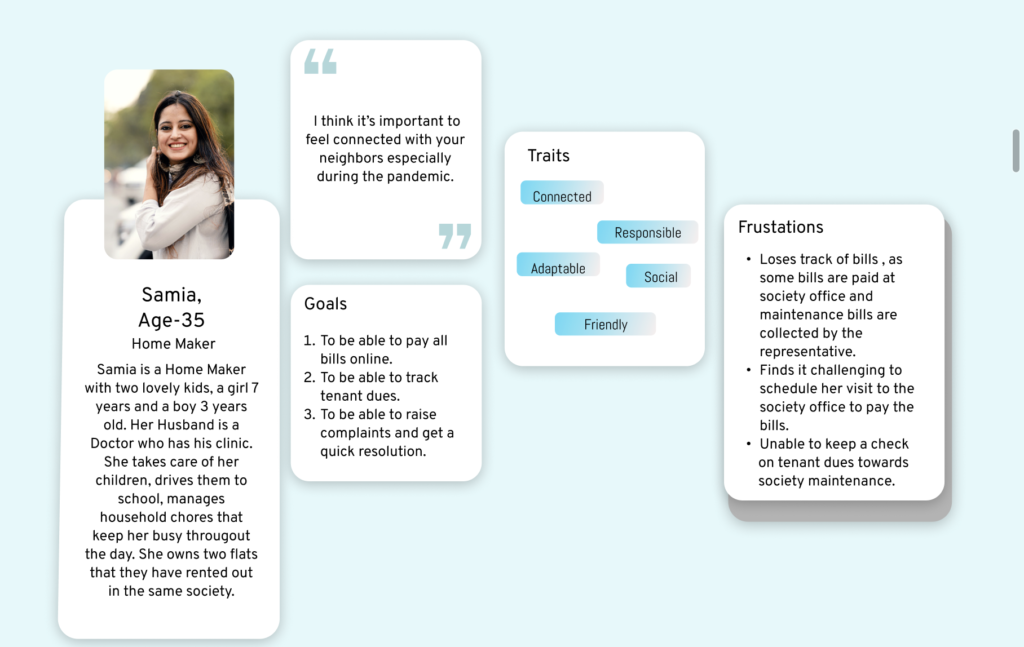
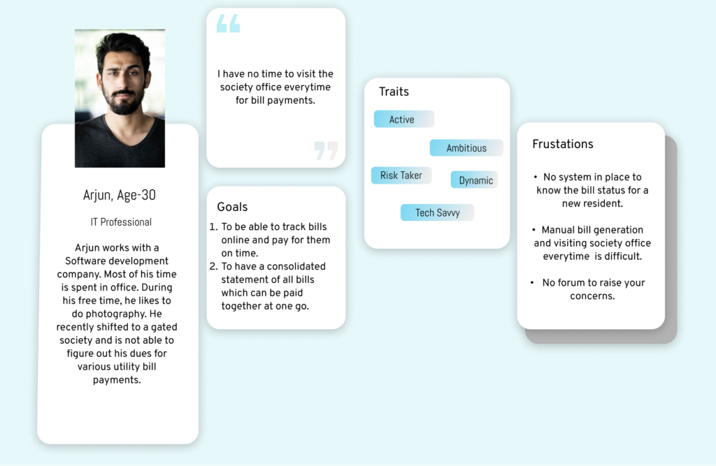
The research helped me identify two personas. The first is a homemaker, and the second is a working professional.
Persona 1, The homemaker
- She finds scheduling a visit to the community office hard and is unhappy with the community rules and procedures.
- She wants to stay connected and enjoy communication.
- She is concerned about the safety of her children and loved ones.
- She wants to keep a check if her tenants are duly making payments towards community maintenance bills.
Persona 2, A working Professional
- He has recently shifted to a new community and cannot figure out his electricity dues for the last two months.
- Due to his busy work schedule, he finds it difficult to go to the community office.
- The community office takes a long time to respond and take action.
Research Results
1. Many gated communities did not have an online platform to keep the community up to date with all that was happening.
2. There was no system in place for payment of utility/maintenance dues.
3. Timely resolution of complaints did not take place.
4. The pandemic made it all the more difficult for the residents to visit the community office or be connected with their neighbors.
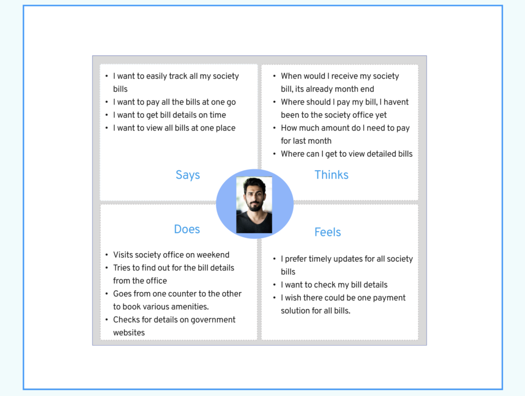
Empathy Map
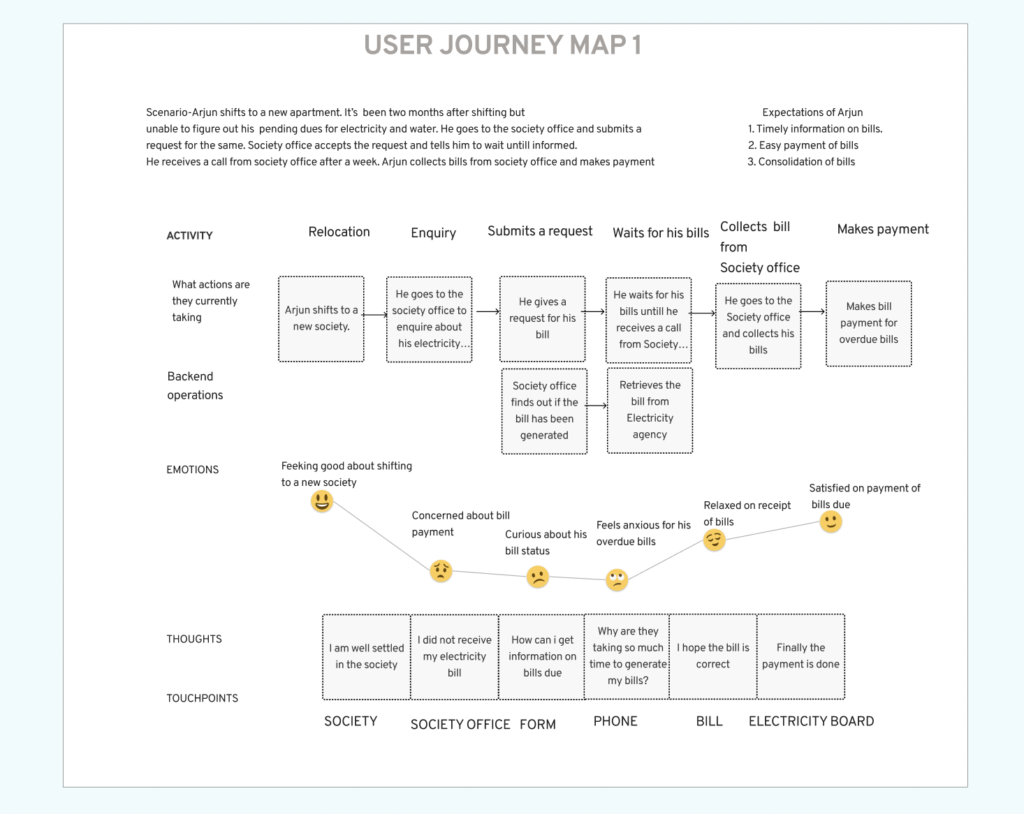
User Journey Map
I designed a customer journey map for a working professional who recently shifted to the gated community and is trying to know his dues for electricity bills for the last two months. Since some of the gated communities in India have a system wherein the community office collects the dues from every apartment and, in turn, makes the payment to the electricity board, I designed a journey map of a new resident and the steps taken by him to pay his dues.

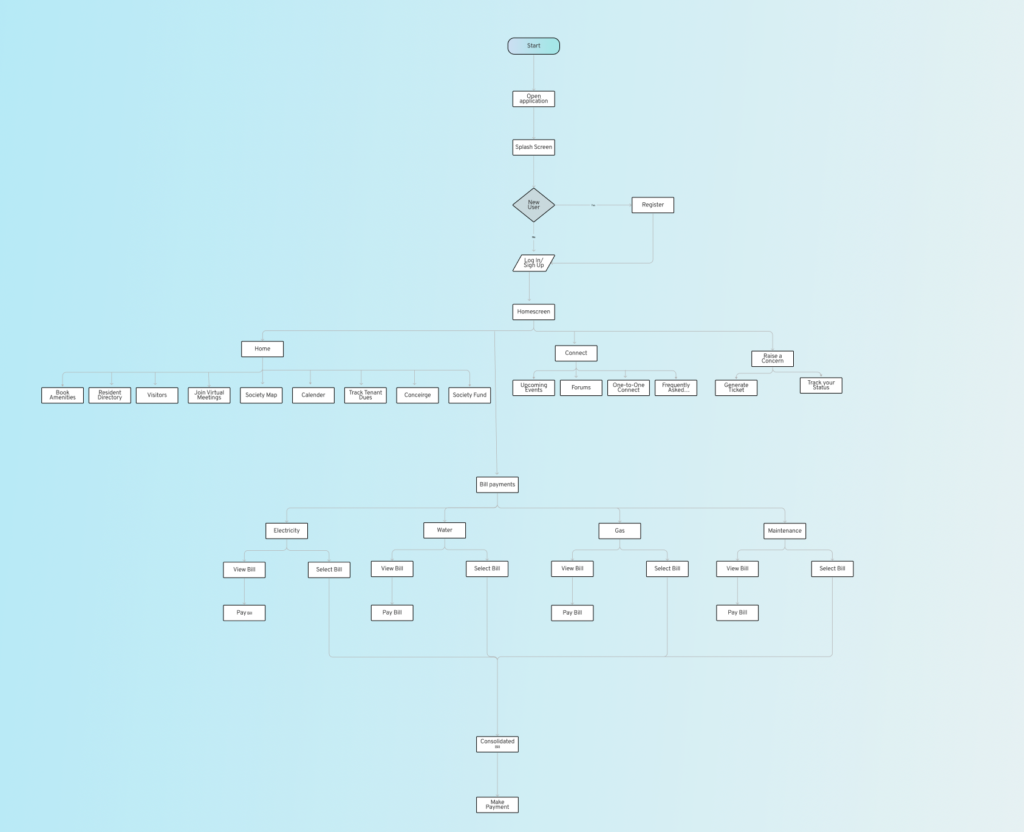
User Flow
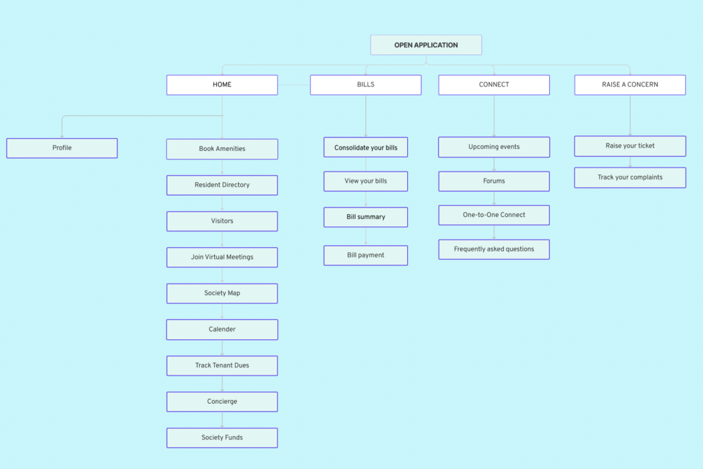
Information Architecture
Design System
I created a visual hierarchy to rank design elements and influenced them in the order I want the users to view them. By using principles like contrast, scaling, color, typography, proximity, whitespace, and consistency, I established each element in its rightful place and helped the most important elements stand out. Also, I tried to reduce cognitive load to make the interface comfortable to interact with.
>I kept my interface simple as my users are residents of all ages.
>I used a lot of white space in my app to make it easier to read and give more attention to CTAs. I chose a gradient of blue and purple as they bring a feeling of trust and reliability.
>I used common elements like checkboxes for ease of use and to get things done more quickly.
>I ensured that elements look and behave the same way so that once a user learns how to do something, they should be able to transfer that skill to other parts of the app.
>I used the typeface Overpass to bring more legibility to the users.
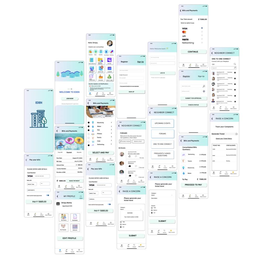
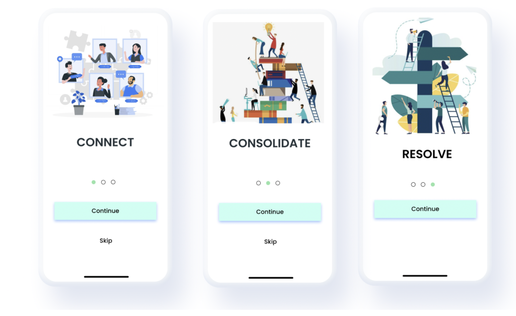
Onboarding Screens
Final Prototypes